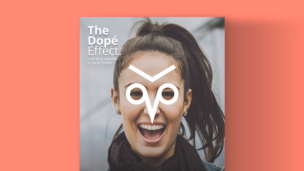
Icon: An owl symbol that represents “awakeness” and a two couple holding a cup of coffee on a table that represents happiness.
Name: DopéCopé means “Cool Coffee” and a combination of two words, “Dope” and “é”. “Dope” is an expression as being “cool” and “é” as “Hey” a Canadian expression.
Font Face: Open Sans represents modern, simplicity, versatility and minimalism.
Colours: Brown - Conveys Coffee, Natural, Appetizing and Homey feeling. Black & White - Shows Seriousness, Simplicity,
Logo: très français = Very French It is an expression for saying authentic.
Icon: A combination of T+F that serves as the Mnemonic Device of the brand.
Colour: Black represents expensive and Red as food.
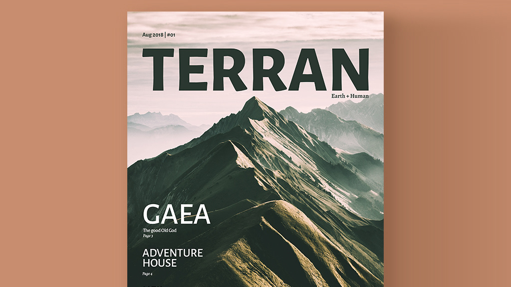
Logo: Roman Goddess the Mother Earth Terra Latin word for Earth Terran or Earthling (SciFi)
Colour: Dark Green represents the living organism.
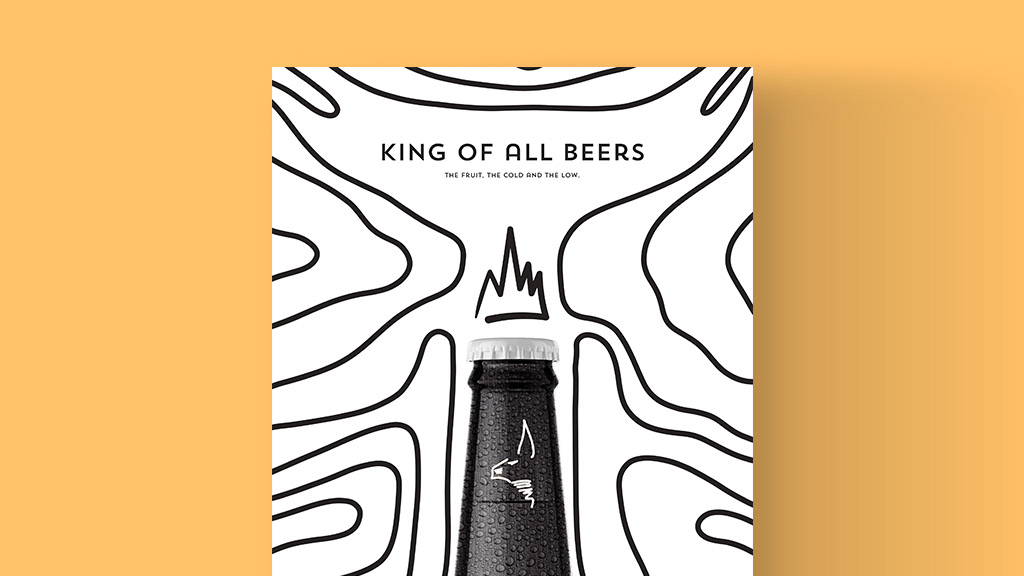
Logo: The name came from Beerus the God of Destruction King BeerUs means - King of all Beers - Give us some beer
Colour: Black & White represents power and being high above all
Logo: Smiley the Iconic element from the 90s
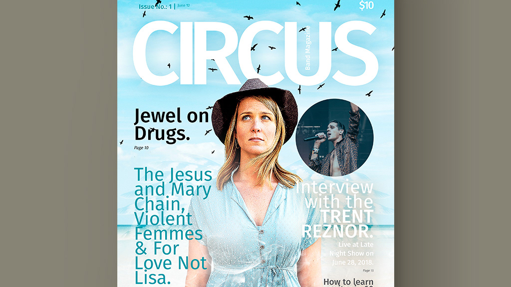
Colours : Black represents rock and roll and Orange as soul of Grunge
Logo: Pencil Head conveys ideas and DL as abbreviation of a name
Colour: Black means ideas from scratch
Programs:
• Illustrator
• Photoshop
• InDesign
